

Thread
iOS App design
Role
Lead Product Designer
Year
2018
Thread is a well established startup and service that aims to help men dress better by sending out weekly recommendations of clothes, outfit ideas and fashion tips. The recommendations are based on input from it's in house stylists and the powerful algorithms they have built in order to send out personalised tips to their users.
Kieran O'Neill the Thread CEO employed myself and Andy Gray to come in to design and ship their first ever iOS app allowing them to branch out their product reach.

Ideate, design and build in 4 months
The initial proposal of the project was to design and ship the first Thread iOS app offering within a 4 month deadline. In order to facilitate a clear way of working we outlined a specific plan to achieve a lean and speedy design and build process that would benefit both design and development from the very beginning.
We put in place some core principles in order to get the best out of the design of the app:

Ideating and moving quickly
Rapid design sprints
Throughout the project we stuck to short rapid designs sprints internally with key members of the Thread product team. Firstly we outline the issue and needs of the sprint in order to give everyone the same grounding, as well as understanding existing issues and design cycles that the website had been through so that everyone had the same solid base knowledge.
Diverge
The next step was to go wide with our ideas (diverge) utilising the crazy 8s system, talking through and quickly presenting ideas back to the group and then doing another round of the crazy 8s. From here we would then score these ideas as a group (converge) selecting the ideas that we all felt would suit the solution, product and time constraints the best.


Converging the ideas
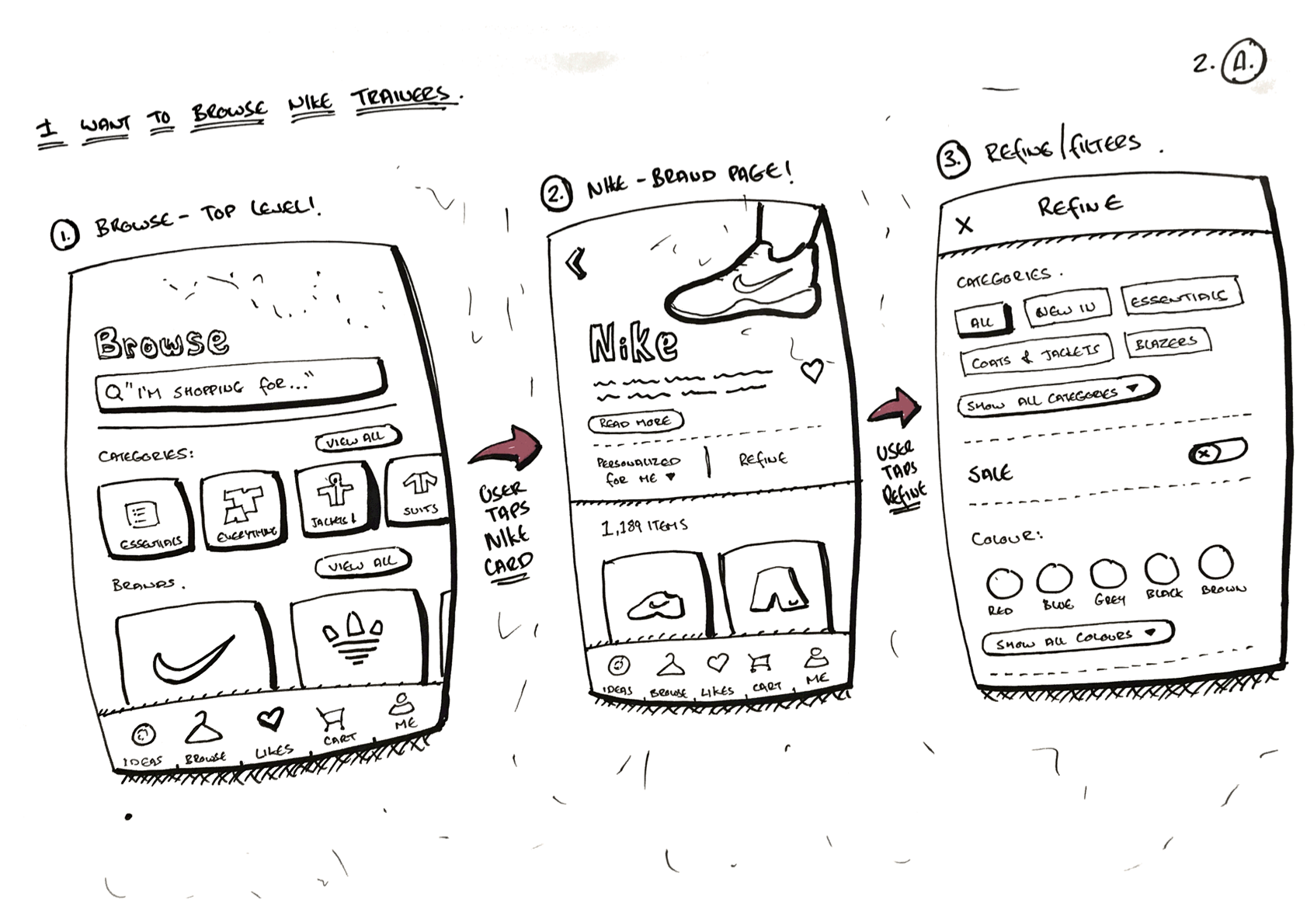
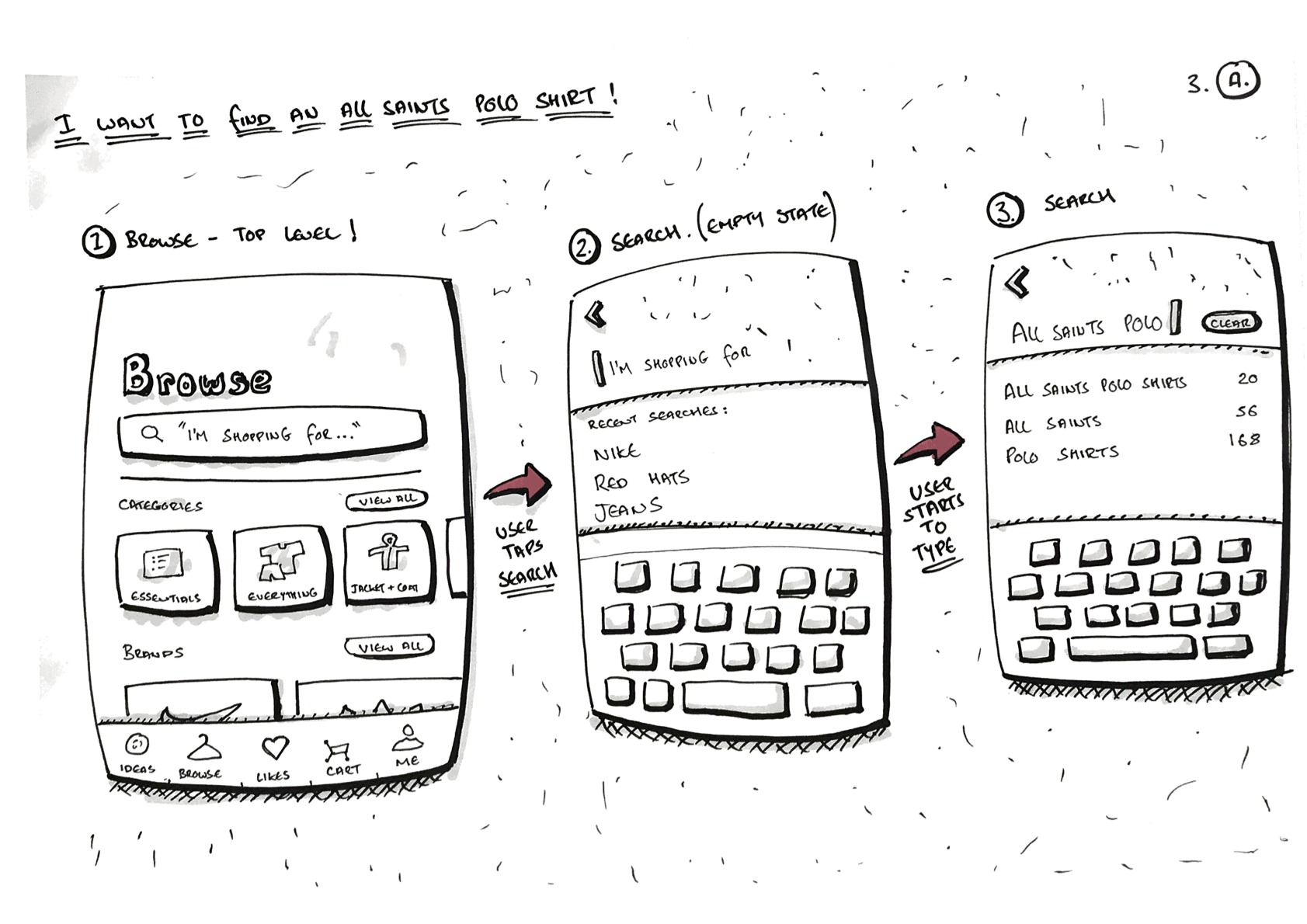
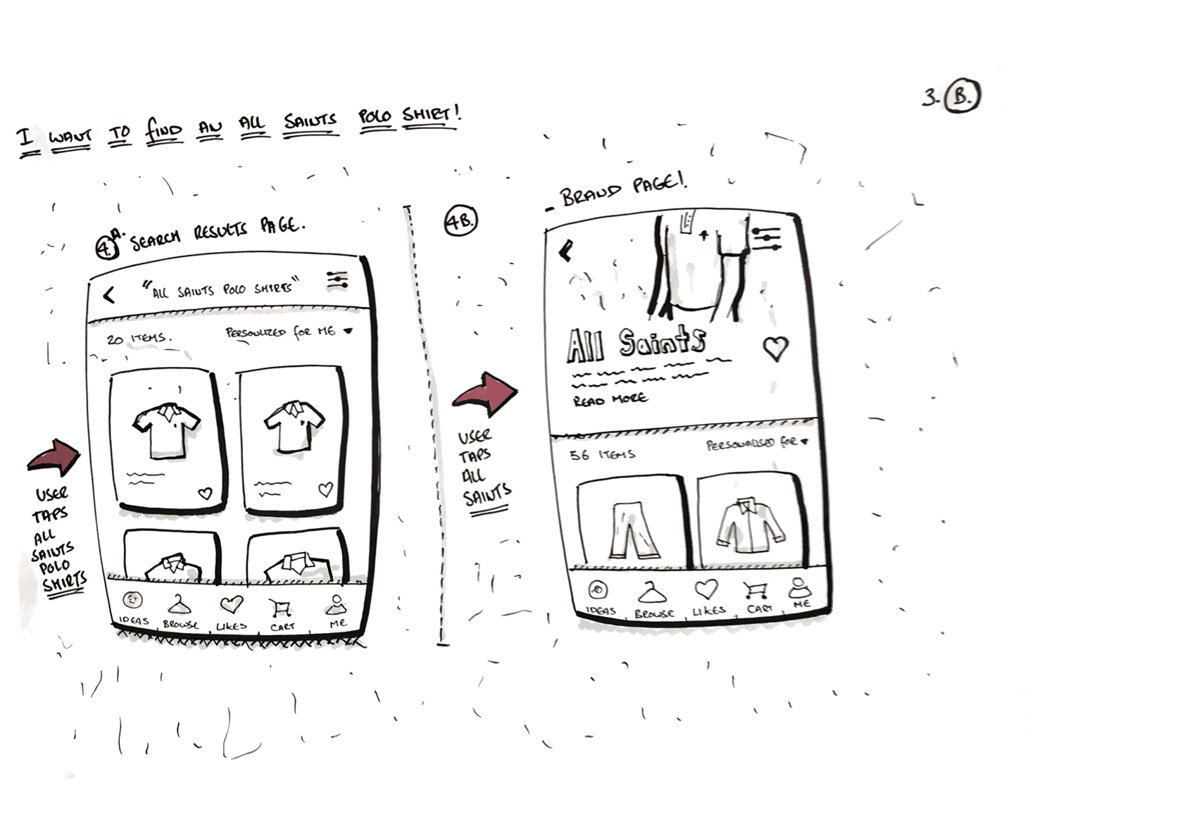
After scoring and selecting the ideas to move forward with, the next phase was to sketch out some of the key user flows in order validate them quickly with some very high level thinking. In this part a lot of key interactions and issues arise which don’t necessarily have to be solved at this stage - however it’s always good to pinpoint them as early as possible.
In some there was a clear path in terms of which idea would solve the problem and sometimes there was more time and effort needed to effectively flush out the ideas that we contentious. By creating user flows and information architecture documents we could target potential pain points with the developers. We needed to be ruthless with decision making in order to save as much time to allow us to move through the rest of the project quickly, and examples of the work below allowed us to do this.


High fidelity and prototyping
The next stage was to move into the design and prototype phase, here we mocked up designs and prototypes for each of the chosen ideas - this was primarily done using Sketch and Principle as it suited the project's speed and allowed us to get the prototypes into people's hands quickly. We would present back to the CEO and others in the product team where we would all focus on selecting the route we all felt was right for the product, again taking into account the time constraints.
At this point many features were delayed until after an MVP release, as is often the case in quick projects like this one. However by designing all of the user flows and edge cases we aimed to alleviate issues that could arise from simply designing for an MVP release and to give the product more longevity past the initial version.

MVP designs
Throughout the design sprints we covered a multitude of sections within the app:
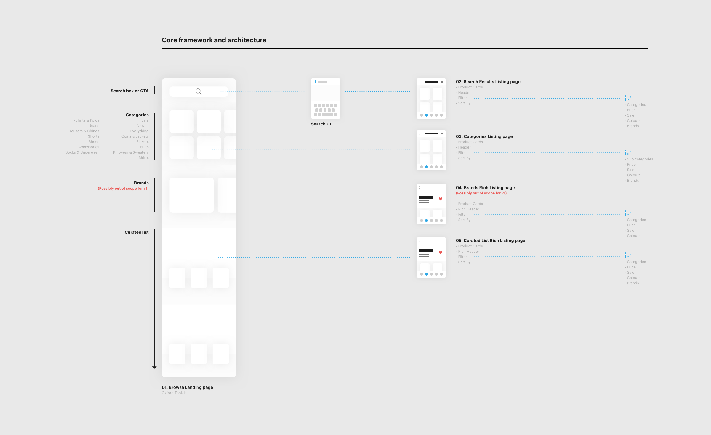
Navigation framework + structure
Product page
Product listing page
Browse + Filters section
Ideas feed (Thread's USP)
Likes
Tips + Essentials
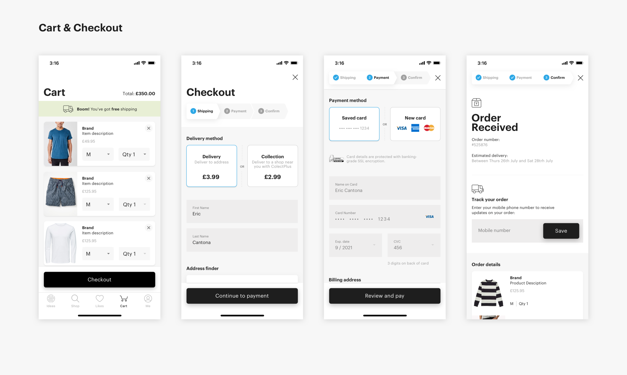
Cart
Checkout
Sign in
Sign up flow
Me (User profile area)
Notifications
Below are a collection of the main screen designs involved in the MVP release of the app, along with other post-release designs.


Deliverables
Working closely in a team with the two iOS developers (Shaps Benkau & Joseph Duffy) meant that the handover of deliverables had to be smooth and effortless, for this we selected to Zeplin for all of the assets side of things also allowing us to import a style guide that we created for the project.


Results
Just over 4 months since the app was released the initial feedback that I received from Kieran and the Thread team are extremely positive.
Retention rate for app users is around 70% - 80%
— 3x higher than was forecasted
The app was responsible for up to 10% + of overall sales