

Shazam
iOS & Android app feature design
Role
Senior Product Designer
Year
2016
Shazam is a globally used and well known app that recognises music, TV and media around you. Having a user base of 300+ million global active users the app is wide reaching and has recently been purchased by Apple.
This is a case study that details how a new feature that is still integral to the Shazam app today (as of early 2019) was created from scratch and shipped by the design and product team. I was part of a 3 person design team in this project, with the other designers being Duncan Riley (Head of Design) and Ellie Pujol (Senior product designer).
Lots of content, not enough usage
What do you do when you have lots of content and want people to see it all? Stick it in a feed of course, why wouldn't people want to use it - after all this is the age of the endless scroll.
Shazam has lots of content, a lot of which was hidden on the app's home screen in the form of a scrollable news feed.
The feed had been introduced shortly before I arrived - but it became something that was seen as a way to grow time spent within the app rather than a great or engaging user experience.

These screens were the 50/50 split with the main Shazam button and the newsfeed.
The Product team set out to address and rectify this problem.
There was a hell of a lot of data and content of varying kinds that Shazam has, so initially I thought having a destination page that users could reach and then decide what particular section interested them could work. I quickly made the below design and prototype to test how this might feel.

The initial prototype, made in Principle

A project is born
The prototype was enough to spark a new project for both the iOS and Android apps. A brief and goals were set, timelines were introduced and the Product team got to thinking about how we could really introduce a more meaningful experience to the user that they might actually want to come back and use.
Goals
• Remove newsfeed from the home screen
• Make it feel that Shazam knows the user
• Inject some fun and movement into the app
• Don't jeopardise time spent


Moodboards I created with some competitor and inspiration analysis.
A thorough period of research and analysis of competitors, similar apps, and other inspirations was carried out in order to give a base knowledge of what was already out there. Through this it became apparent that there was indeed a lot of apps with landing/destination pages, but this was hardly original.
Throughout the research phase what did become apparent was that instead of giving the user all of the content that we have at our disposal was that perhaps we could tailor it more towards their personal tastes and interests based on some key data we had on each user.
A personalised feed wouldn't cut it, as the previous feed proved that wasn't improving usage, but instead what did get talked about was a trimmed down carefully selected amount of data given to the user. Something that was easy to scan through and didn't require too much time but might actual make the user interact with it's contents more.
From this was born the idea of a digest.
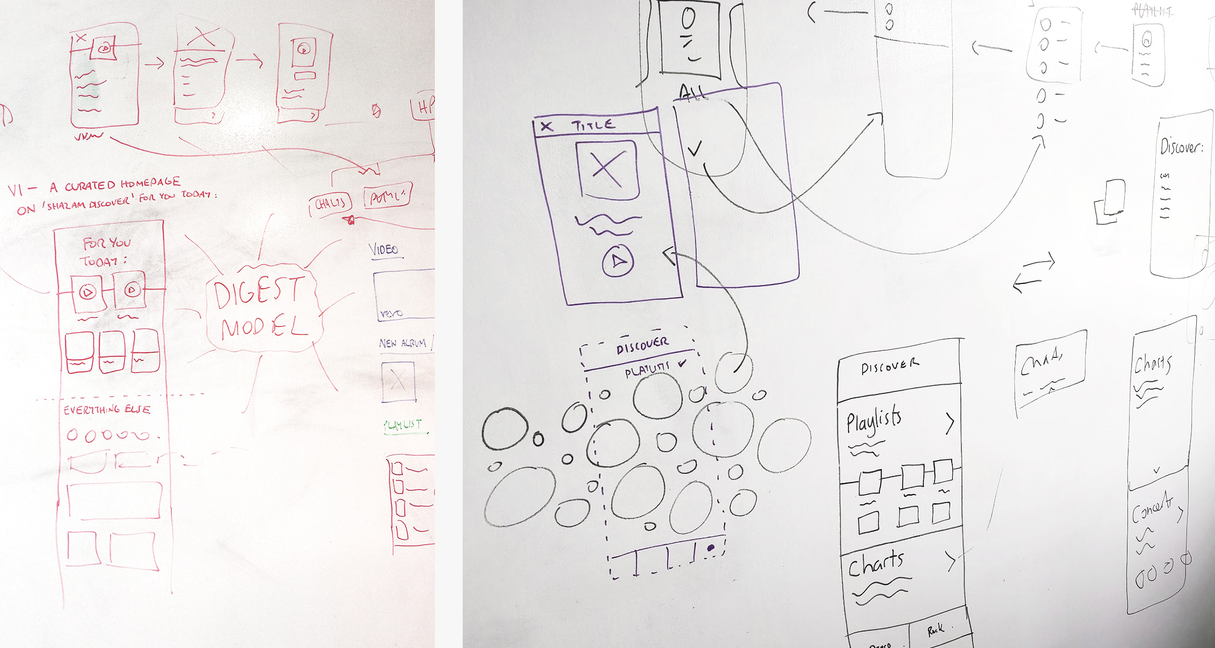
Multiple whitebaording and idea generation sessions showed how the initial ideas for the Discover feature evolved. Here you can see the 'Digest Model' that came off the back of the initial research stage.
It was decided from the beginning of the project that feature should be delivered on both iOS and Android in tandem and so there was no bias when it came to designing for either as the idea was to have consistency across both platforms.
With the PM I created a wireframe document that detailed the different types of content cards that could be made from the data we had available to us. It would prove as the go to document for the product and development teams going forward with this project and allowed anybody involved to see how each piece of content would function going forward.

The original IA and Wireframe document that served as a solid starting point for the project.
Throughout the design process it was integral to produce small interaction prototypes to see what felt fun, fluid and fresh. Static designs can only do so much. Especially in the current climate of app development the boundaries of movement and transitions are being pushed with every new OS update, which makes being able to bring your designs to life more important than ever. It was clear that we prioritised usability and experience over aesthetics at this stage.
Before the card designs for the digest were really introduced I created some basic prototypes to get an idea of what would feel interesting and fun for the user.
A vertical stacking card concept, in which the background (theme) colour changed according to what genre of card type you were being shown. The introduction of more colour ended up being a large driver in selling this to the board as a more fun and vibrant section within the app.

This side swiping idea is more obvious to a user that there was more information available, however it didn't fit with the Android app's paging navigation so had to be scrapped.

This prototype introduced the idea of the digest model being dragged down from the "landing page" - an idea that ultimately failed as the unique content started off hidden from the user and was deemed hard to find and (ironically) discover in user testing sessions.

Another side swiping interaction prototype that toyed with the idea of having a progress indicator to show the user how far along they were. Lots and lots of visual clutter appeared here, even when the cards weren't designed.
I created various prototypes that we could take to our internal user testing group to see which designs and interactions they understood and preferred. Having an audience give you unbiased feedback on your work is a great way of keeping you grounded, and also an even better way of knowing whether the work you are doing will ultimately make sense to the end user. There's no point in attempting to create a visual masterpiece if it adds no value or doesn't delight a user.
During the user testing it became more apparent that the idea of having a landing or destination page was less and less appealing to people, and so from this the digest model we had created ended up being the focus for the MVP release.

Some of the designs for the digest "shell" that I produced.
As is the case with lots of design, the more you take away from it, the better it becomes. Throughout the iterations of the digest cards the more information and clutter that I could strip from the card, the better the focus was on the actual content - and this after all was what we wanted the user to consume.
Many rounds of UI designs, interaction tweaks, and user testing followed. Below you can see how the digest and card designs really evolved throughout the project.

The initial card designs
The first round of card designs ended up being a bit too erratic, and it wasn't sure what the purpose or focus of each card was. There we CTA buttons all over the place and there wasn't really a solid design structure or hierarchy in place so that a user could understand what they were being shown.

A more unified approach to the card designs.
The next round of card designs aimed to simplify and unify the design structure a little better than previous ones, however when in situ they all started to blend a bit too much, so we decided that we needed to find a happy medium between unique and uniform so that the user wouldn't get bored but could easily recognise a card type without having to decipher what they were seeing each time that they used the feature.
Plenty more iterations of the cards were designed and tested until we found a happy medium that was both engaging and deliverable.
Discover is launched
As is normal throughout a design process there were lots of little ideas that were being played with, tried and tested to see what added any value to the content and delight a user in a way that couldn't be measured by numbers of beacons.
I worked closely with the iOS & Android devs to hone the interactions and try to get them as close to the originals I had created as possible - they did a fantastic job in regards to the animations and gestures that the whole experience was hands down the best work that has ever been shipped in a Shazam app (besides the obvious recognition wizardry!).
Below are the final shipped screens taken from the live apps. Feel free to download the app to see Discover for yourself 🙂
