Sportsmate Mobile - Australia
App and web design
Role
Lead Designer
Years
Mar 2012 - Feb 2014
Sportsmate Mobile is an Independent startup founded in 2009 that creates and distributes native iOS and Android apps. Focused on delivering lightning fast sport scores and stats to sports fans all over the world, with over 10 million global downloads and 3 billion sessions they are Australia's number one sports iOS and Android native app network.
I moved over to Melbourne specifically to work with the small but extremely talented team to push myself and gain better experience in delivering full blown end to end product releases.
In early 2012 I packed up my belongings and headed to the other side of the world to work with a small startup that specialised in creating great sports app in Melbourne, Australia - for a job that I had found via twitter. How 2012 is that intro.
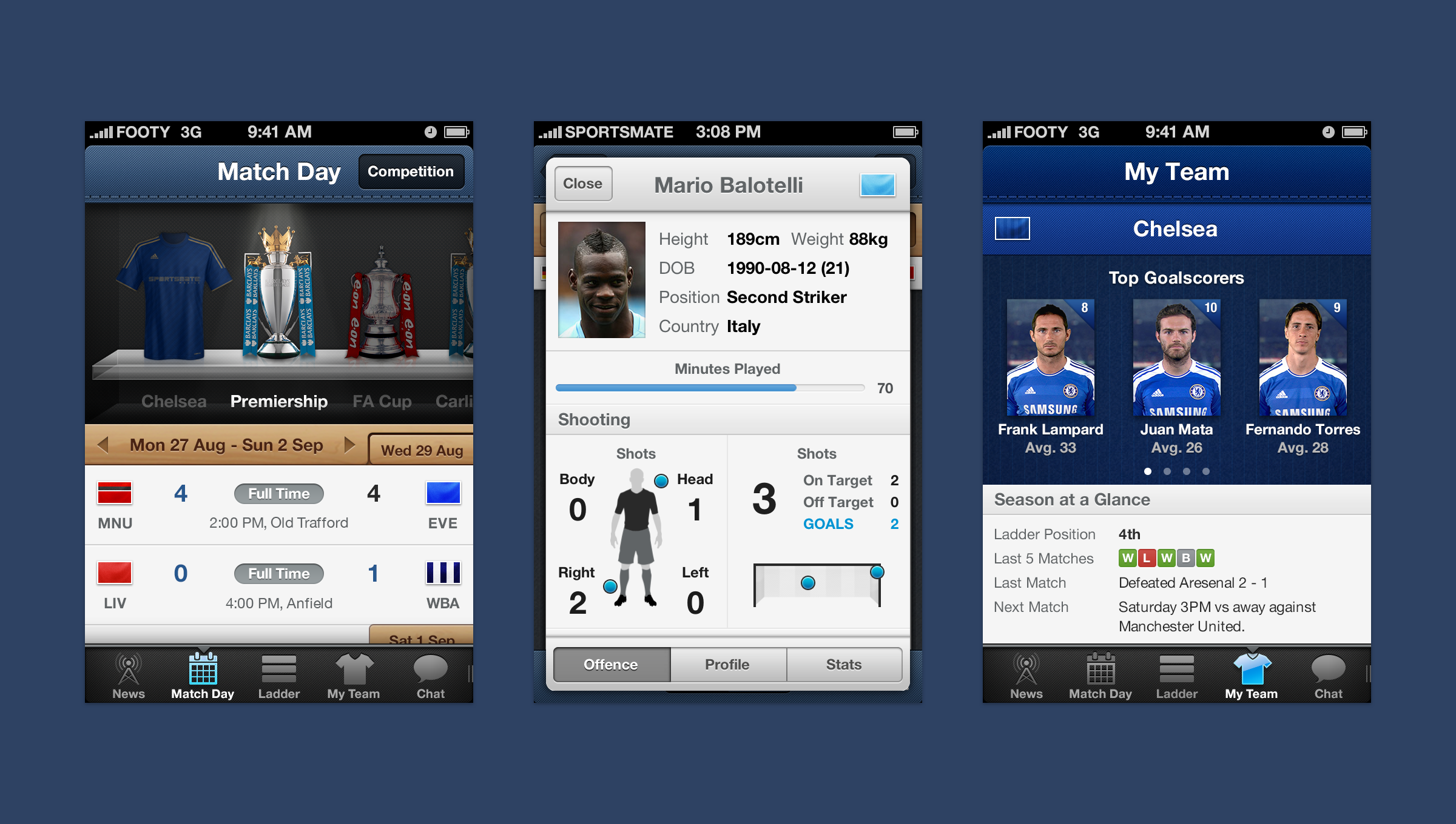
I arrived in a time where Skeuomorphic design was the expected norm - textures everywhere, buttons looking like buttons and each layer in Photoshop had to have at a minimum of 3 layer styles.
I was brought into the company of 7 people to be their 1st in house Designer, I was in charge of anything and everything that required design input, from all the of the product design, website, social and also some marketing collateral.
Sportsmate had a monthly user base of 4 million, with an offering of 3 core apps across iPhone, Android & iPad:
• Footy Live (previously Aussie Rules Live)
• League Live
• Union Live
The icons were one of the first things I updated when I arrived
iOS 7 = Redesign
The world of app design flattens out
In September 2013 the iOS design world had a massive shake up with the introduction of iOS 7. This meant that in order for Sportsmate to stay current and on the cutting edge of app technology we had to improve our offering, not just in a design sense but in a technical side too - we couldn't stand still as the new OS was announced.
Visually a combination of textures, such as grass, wood, glass and navigation bars complete with stitched effect didn't exactly resemble what iOS 7 stood for.
About a year before the Android world had already been going through the transition from skeuomorphic design to flat design, this gave me a head start in some respects as to how to approach updating the look and feel of the apps, as well as introducing more fluid gestures into the app to improve the usability for the end user.
A comparison of the old designs and the new screens
The outcome managed to maintain a balance of the new flat aesthetic without completely losing the character that Sportsmate's Live apps had been known for over the years prior to iOS 7.
Plenty of gesture driven navigations were introduced to allow the user to easily move between a vast array of the match day stats and information available, this along with a new sleeker toned down design aesthetic really brought the apps up to date and in line with what was now expected from apps. No longer were they just useful and kitsch. They were now fast, seamless and responsive.
A selection of the app's interactions
iPad redesign
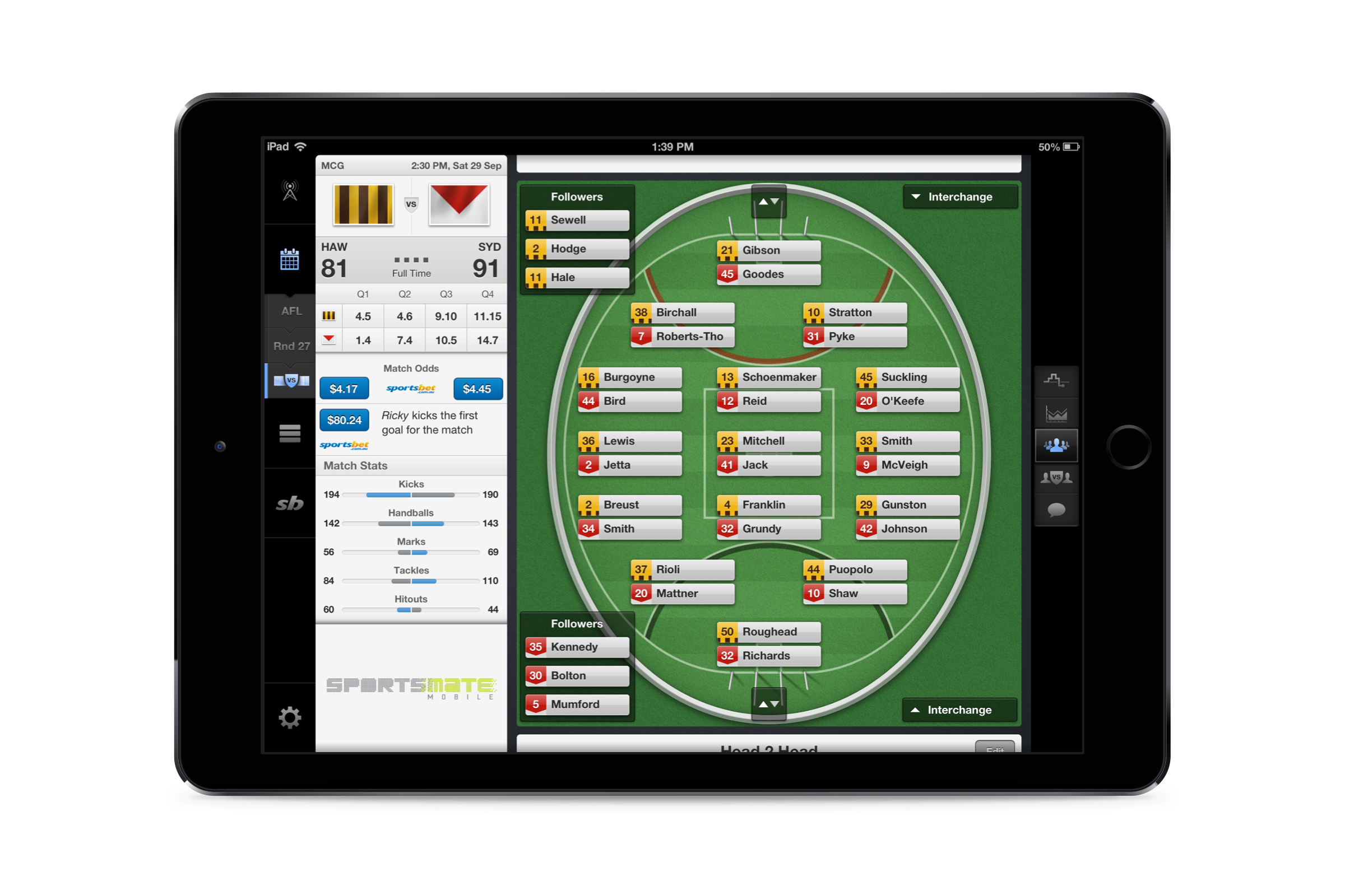
One of the biggest tasks I had while working at Sportsmate was to completely redesign the iPad app from the ground up.
The old app was effectively an upscaled iPhone app that had been made to fit into an iPad without too much thought going into a unique experience for iPad users. After lots of research and current trends it was decided that the best use case for the iPad was as a companion for sports fans whilst watching a live game - the perfect second screen experience.
Sports generally have a lot of plethora of data readily available, and the Sportsmate apps were no different. We had partnered together with Opta Sports and therefore I had a multitude of stats at my disposal that I could include in the apps. This made for an experience which the user could immerse themselves in whilst watching the game live.
Interactions I created for the iPad app
“I thought nobody could ever improve on the football apps that were already out there but Sportsmate did it. You can tell that they have a knack for developing apps. The app looks slick, is quick to load and update...”
Android
A nice parting gift a few months before I returned back to the UK was seeing the Android version of Aussie Rules live getting recognised in the Australian Play Store as one of the best apps of the year.
The Android app when I arrived was effectively - as was most often the case around that time - an iPhone app ported across onto the Android system. I worked closely with the sole Android developer in Sportsmate to make the apps an experience that were native solely to Android instead of an iOS copy.
As there were hundreds of assets that were needed to be used across all of the sports teams etc we managed to find a way to drop a sizeable chunk of the file size of the app packages by using SVGs rather than bitmaps - this not increased the size of the app but the performance and responsiveness of the app.
Football or Soccer?
My main focus when I first arrived was to help the Sportsmate team create an app for the English Premier League and other football competitions as this was an area the team really wanted to take their apps.
I quickly got to work to update the current shell of their app to tailor it more towards a football audience, not only did this include visual changes, but also large changes to how the user could select what league and competition they wanted to follow.


